SimplePractice - 2025
Enrolling clinicians with multiple insurance partners at once
Overview
The insurance experience had various hurdles that users needed to jump – one of those being a hurdle of our own design! On average, clinicians work with 4-6 insurance companies, and our experience required them to manually enroll each one, forcing them to repeat the process over and over and over again.
During a team onsite, we identified areas in our product that were holding our customers back, and our enrollment process was one of the biggest culprits. That area had been on the team’s mind for awhile, begging for a redesign, so when the opportunity to address enrollments arose, I jumped at the opportunity to execute the vision I had for insurance.
Where we started
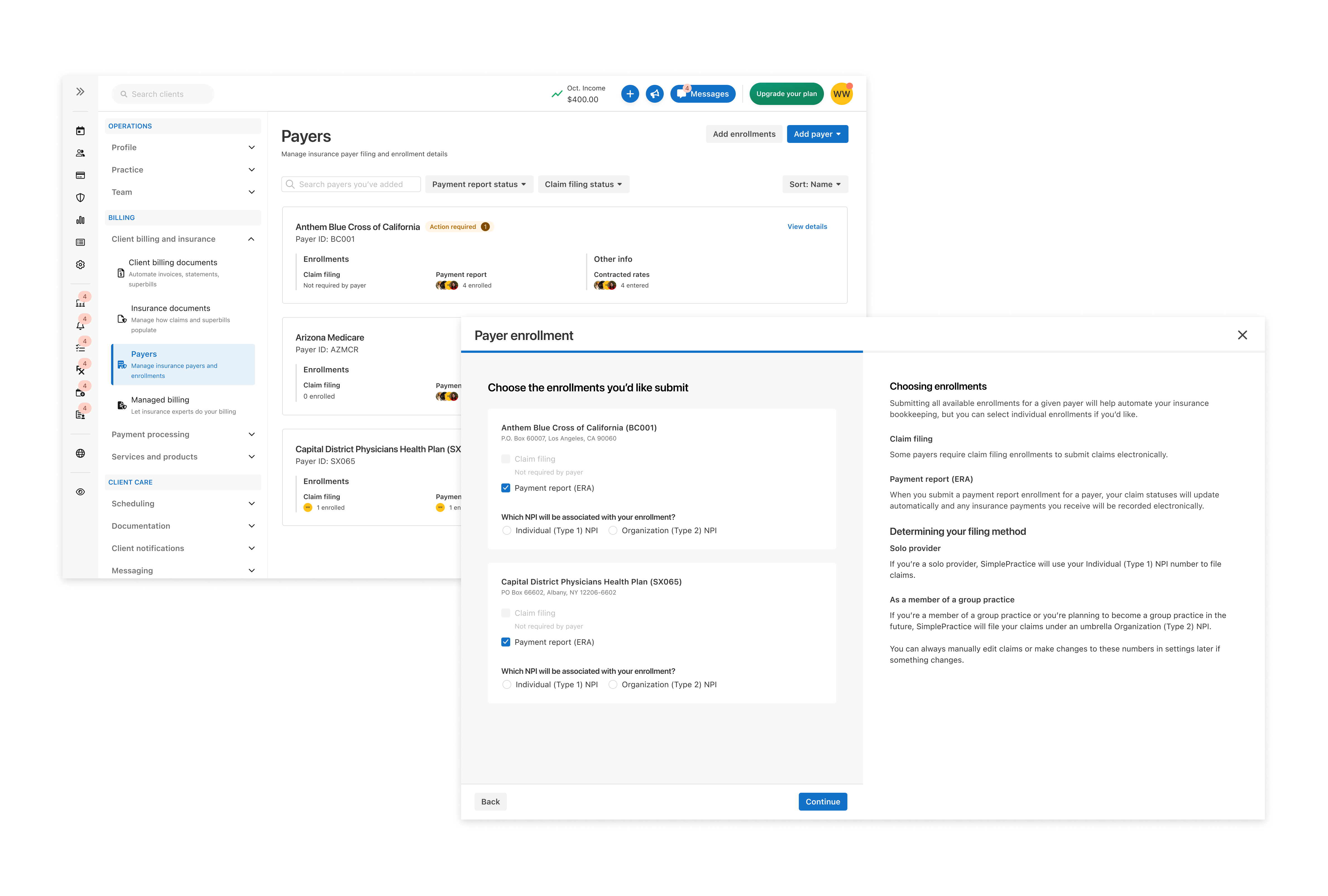
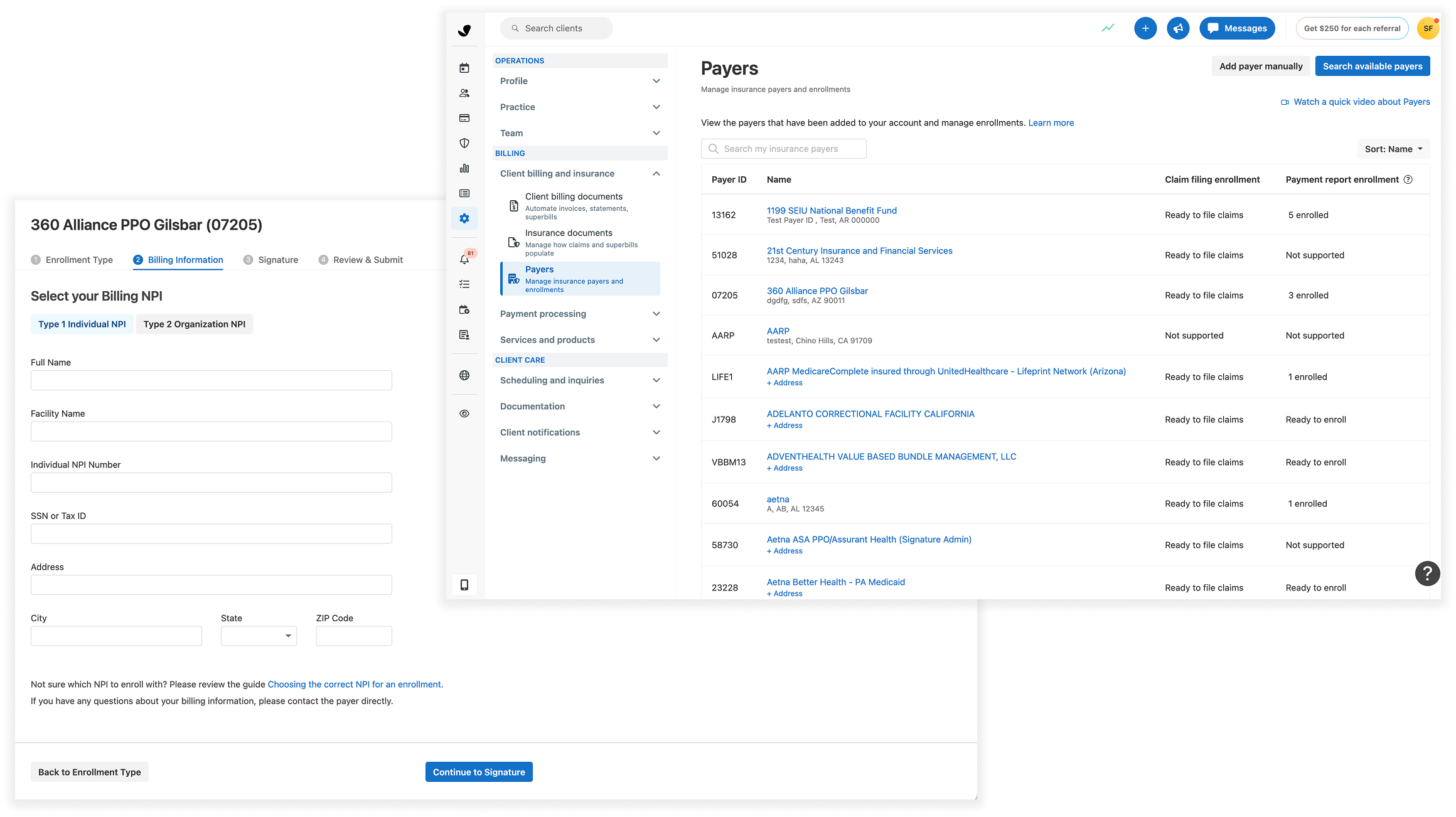
This project provided the opportunity to do a front-facing visual overhaul, as well as a shift in the experience. Before our redesign, a clinician had to enroll with 1 insurance at a time (for context clinicians typically worked with 4-6 insurance companies). The form required manual entry for everything, despite some of the information already having been collected in the clinician’s account – a frustrating experience that was low-hanging fruit marked for improvement.
The hope with the redesign was a reintroduction, transitioning users from the idea that enrolling with (insurance)"Payers" was just a section of settings but rather a hub for all insurance payer info to live.
Goals
Our goal was that we wanted to decrease the time spent on enrollments and aimed for at least a 20% reduction in the amount of customer support tickets opened under the topic of enrollment – many of which arose from the process itself.
My role & the work
We were a seasoned team with a very short timeline to execute a big overhaul, so we hit the ground running with high def designs. Because of the timeline and my dual role of Lead Designer and PM for this project, I had no time to waste. I wrote out eng requirements, had a senior PM review them, and went to work on designs. A perk of doing double duty is that I was able to work more quickly because I knew the project requirements, and through this found that I really enjoyed dipping into the PM mindset.
I started with broad design explorations, to ensure I wasn’t boxing myself into a specific solution, all I knew was that I wanted to narrow down to something that allowed a multi-selection interaction. I’d also been having ongoing sidebar conversations with our engineers about the possibility of utilizing autofill for information we already had, so I wanted to find a way to incorporate that as well.
Design challenges
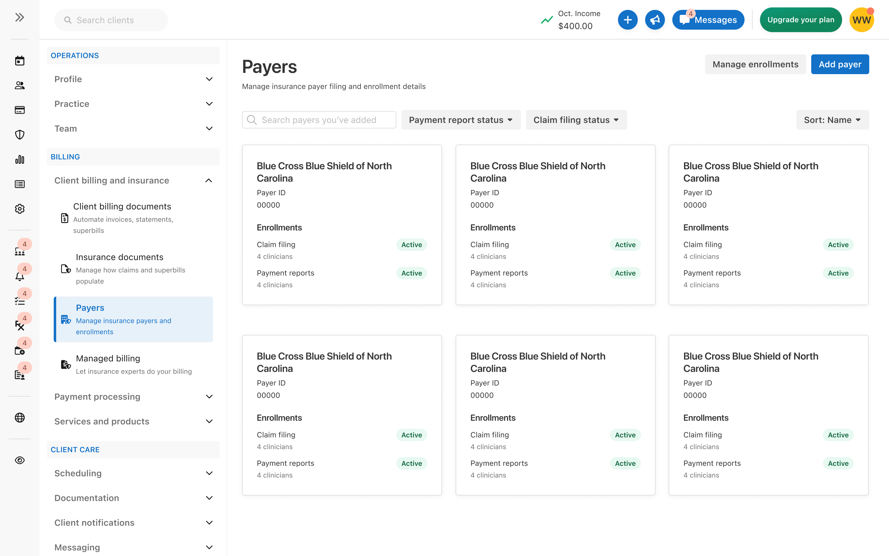
I really value feedback, and when something I’m trying doesn’t feel like it’s quite hitting the target, I like to turn to my teammates. I went to my design peers in our larger finance design team for feedback and after a few hours of collaboration, we were confident in our new design. We knew moving away from a table format and introducing a new card format would allow us more real estate to show more info on the smaller screens our users tend to use.
My first version of the design was met with a lot of valid
feedback from the org design team at large. There was a lot of
concern about the IA and confusion with design, and those other
voices and perspectives pushed me to keep iterating on it –
something I’m grateful for as I test new ideas and push my
designs to a new and better level. I worked closely with my
smaller finance design team, going back to the drawing board but
not straying too far from the design we’d been working with,
eventually landing on a horizontal card format that was more
simple.
[visual of this cleaned up format]
Closing
We moved to a more time-efficient flow that would autofill where possible, and allowed multi-select of payers. Our goal was to cut down on time spent doing this tedious task and get clinicians filing claims sooner. This is a sister experience to an existing insurance onboarding set-up we did earlier in the year, so we kept with the theme of educating users on what each step was without overwhelming them with terminology. The goal of our family of experiences was to make insurance easier to accept for private practices.
This project was recently released to all of our users and we’re already seeing positive early adopter feedback! The work we created was very rewarding, and l really believe in the design we delivered. In overhauling one experience, we were able to also reimagine the main page and the insurance company selection, two big spaces that are frequented by clinicians. In doing double duty as both Lead Designer and PM proved to be rewarding and challenging in its own right – on one hand, I liked the PM mindset, but I ultimately missed having a product partner to work with.