SimplePractice - 2025
Setting up clinicians for practice success with a new approach to onboarding
Overview
Early SimplePractice offered customers a Choose Your Own Adventure experience, but as our product and customer base grew, it became clear that this model was no longer working. We kept receiving feedback from the clinicians using our product that everything in our experience was just too confusing – and they were right!
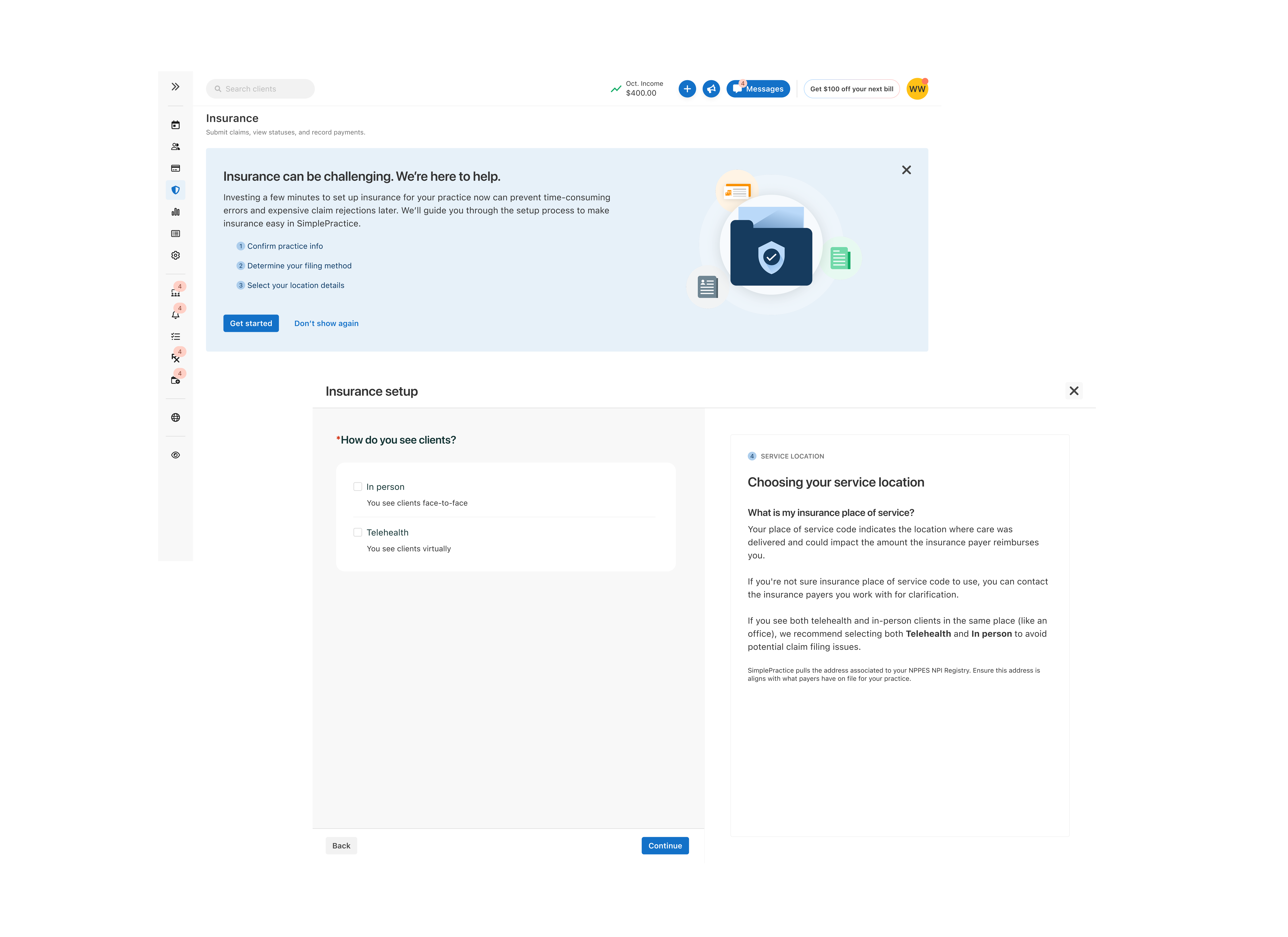
Our experience would throw new users into the deep end of the insurance claim filing experience, with no introductory onboarding or walkthrough. Clinicians would have to rely on a help center guide full of screenshots to get them through set-up. When I first joined the team, I walked through it myself, realizing it took over 19 clicks and 7 pages of the product to complete just the onboarding process. This was too much effort and time for our users and after feedback and review, it became one of our hypothesized reasons that clinicians weren’t even attempting to use our insurance tools.
Goals
Our aim was to make this short and educational for the clinicians. For us, this looked like consolidating all of the form fields into one space and teaching clinicians about why this information mattered to their insurance process. We did this because we wanted to do more than simply collect info, but rather we wanted to empower them by removing the fear they had when it came to working with insurance. Success with these types of projects is hard to measure, because it’s so often a slow burn success. Because of this we separated our measurements of success into two metrics:
- Primary: Time required for completion of flow — This would show us where the experience might be too complicated or where we’d may be asking for too much information
- Secondary: Time to file first claim after flow completion — We knew we had done our job well, if they got here faster. Claim filing was our team’s overarching metric for the year, as it is the primary revenue driver.
Complexities
Because we serve an extensive set of user types with varying access permissions, we had to configure what the experience would be for a biller, practice owner, and clinician. We landed on concealing some fields based on permission level, but keeping the core content the same and educating all users – even if they weren’t inputting info at every stage, their understanding of the concepts mattered.
A high level question we had was, “how should the user feel during this?” Using the qualitative research and feedback comments from online communities, we landed on educating and informing our audience. Time and time again, these users expressed confusion and frustration about not understanding terms or what the next step was with claim filing.
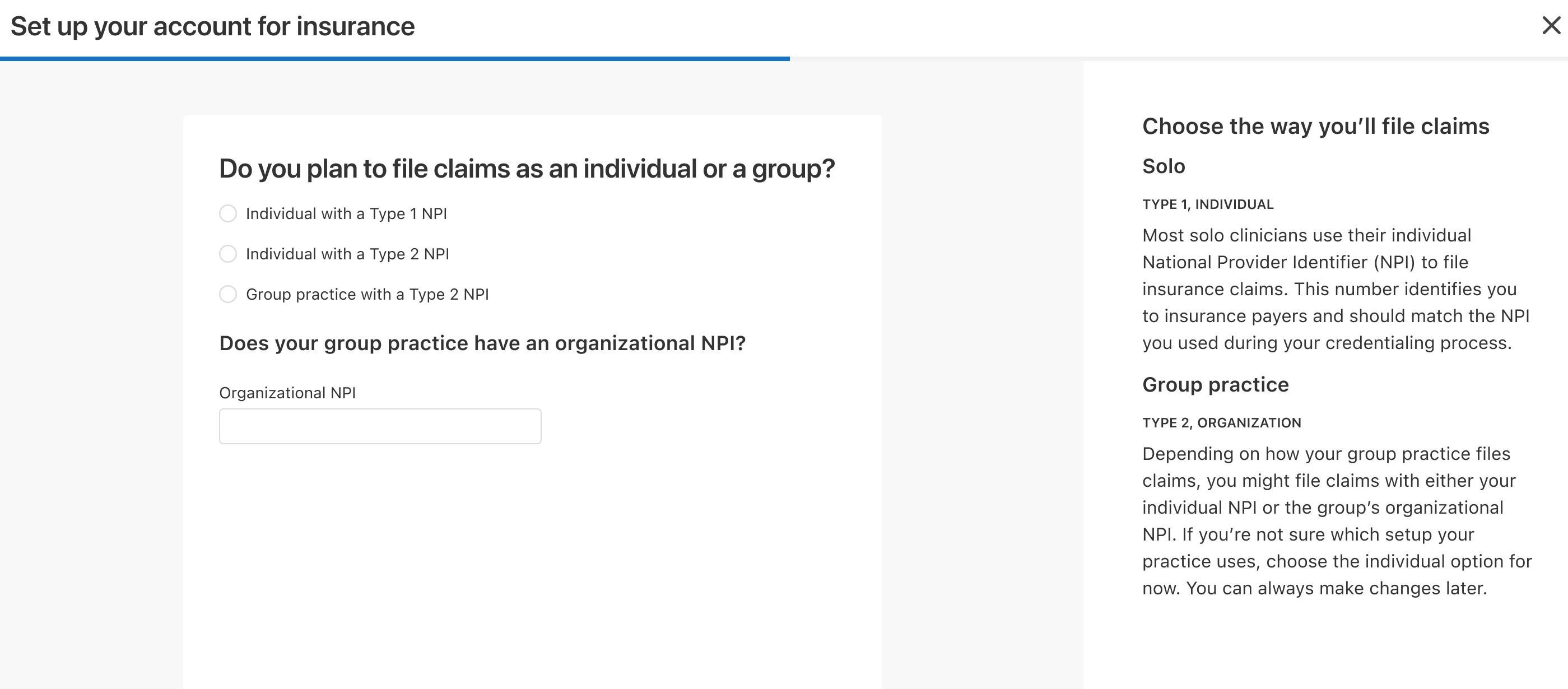
Additionally, on the technical end, our team wanted to push further, so when a user dropped off, we saved all of their information. This behavior wasn’t yet a pattern in our product and it was our first time enabling it. We also integrated with the National NPI Registry to auto-fill the form, based on their NPI ID the clinician had given us, we’d populate what was given to the national registry, making it less work for the clinician.
Results
As of right now this project is currently released to a small audience of 500 practices. We’ve seen little to no drop off on this flow and increased claim filing from this group. Because of its small scale success and us working out the bugs in this stage, the team is preparing to launch it in late January 2026.
Reflections
There was a lot more we could have introduced in this experience that we chose not to, such as requiring more fields to be filled out than what we did. This was because we had a concern that customers would be hesitant sharing their NPI (a clinician’s version of their SSN) in the same way that users of most products are cautious about sharing their SSNs. I’d be interested in seeing the metrics and fill rate to determine if that was still our best choice.